 Weddings
 Portraits
 Headshots
 Events
 Product photography
 Social content & reels
 Graphics & posters
 Logo & title animation
 UX/UI design
 Automations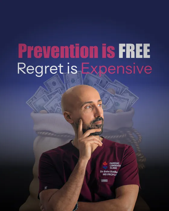
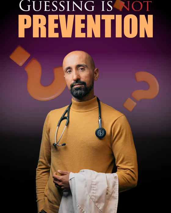

rudqp.com
A photography studio website that books clients, delivers their photos and follows up on its own. I designed every screen, directed the build with Claude, and run it on my own server. This is the project I am proudest of, and the one I know best.
What you are looking at
Every pixel decided by me. Not a template.
- Designed by a photographer, so the pictures always lead.
- Booking, client login, galleries and a studio dashboard, all built for this site.
- Light and dark mode, tuned for phone, tablet and desktop.
Designed and directed by Rudraksha. Built with Claude.
Brand board
The brand, on one board.
Before building a single page I settled the identity: what the colours are, how the type behaves and what the site is never allowed to do. Designed by me, built with Claude.
Three quiet letters, two loud ones
The gradient lives only in "QP", so the mark works at any size, on white or black.
Two neutrals do most of the work
Ink on white in light mode, near-white on true black in dark. Colour is a highlight, never a background.
Inter / 400 / 1.6 line
SF Pro on Apple devices
One family, no script fonts
Tight, confident headlines and calm body text. Never cursive.
8 themes tested, 1 chosen
Cobalt, Forest, Noir, Marigold and more. Spectrum won.
- Photographs always lead
- Colour only as a highlight
- No script fonts, ever
- Tablet shares the desktop layout
pages in light and dark
All following the same board.
Interface details
The small things you feel but never notice.
None of these are in a template. Each one exists because I wanted the site to feel considered from the first hover to the last click.
A menu that shows, not tells
Hover any service and a photograph slides in beside it. You choose with your eyes before you read a word.
Eighteen photos on a wheel
The home page opens on a slowly turning ring of frameless photographs, clipped at its centre line so it reads as a horizon.
No white flash
Your theme is read before the first paint, so dark-mode visitors never get blinded on load.
Magnetic buttons
Move your mouse near it. The button leans toward you. Only on a mouse, never on touch.
Text that never jumps
Fonts are self-hosted with metric-matched fallbacks, so nothing moves when the real font arrives.
Site-wide search
Press the keys and search every page and price. The index is generated from the pages themselves.
A live, honest number
Real visitors from my own analytics, counted in the last five minutes. If nobody is here, it says nothing.
You ask for more
Galleries show a first set, then wait. Nothing loads on its own, so the page stays fast and calm.
Motion that steps aside
Reveals, tilt and the camera cursor all switch off for visitors who ask for reduced motion, and on touch screens.
Tablet gets the desktop
A rule I set early: tablets share the desktop layout, phones get their own. No awkward in-between design.
The booking flow
From "I like these" to a booked date, with no dead ends.
The whole flow lives on one page. A visitor proves their email with a six-digit code, tells me about the shoot and sees a quote. I get the request in my dashboard and accept it with one tap.
Start with your email
One field. Nothing else is asked until we know you are real.
Enter your code
A one-time code by email. No password to invent, nothing to forget.
About you
Name and phone, prefilled if you already told the site earlier.
What are we shooting?
Pick the shoot, the date and the place. Availability is checked live.
Your quote
A price on screen, a request in my inbox, and a confirmation in yours.
Every email designed to match
Under the hood
Pretty on top. Serious underneath.
What you see is the top layer. Under it sits a full booking and client system, all designed by me and built with an AI-assisted workflow using Claude.
- 01DesignLayout, type and motion, all drawn by me. The photographs lead and everything else stays quiet.
- 02Front endHand-written HTML, CSS and JavaScript. Light and dark mode. No page builder to slow it down.
- 03Booking and client portalEnquiry forms, one-time code login and private galleries for every client.
- 04CRM and automationsEvery enquiry tracked from first hello to final invoice. Confirmations and follow-ups send themselves.
- 05My own serverThe site and the galleries run on a machine I control. No platform lock-in, no monthly ransom.
The studio dashboard
One screen runs the studio.
Behind the login is a dashboard I designed for myself: bookings, a calendar, every client, enquiries, analytics, my services and prices, and the text of every page. Nothing is off the shelf.
What happens when someone enquires
Designed and directed by Rudraksha. Built with Claude.
Websites, designed and built with AI.
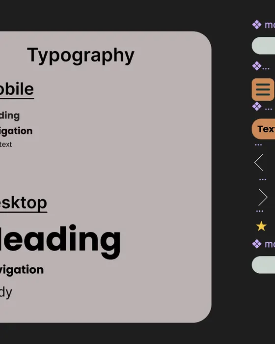
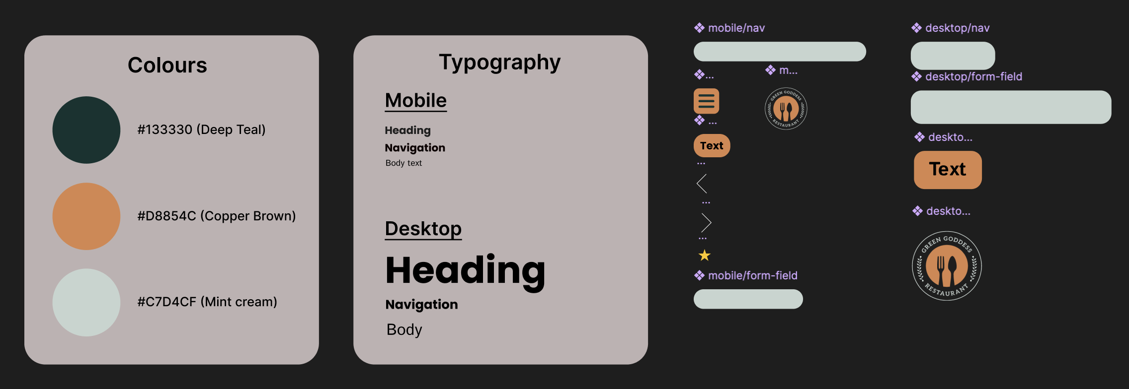
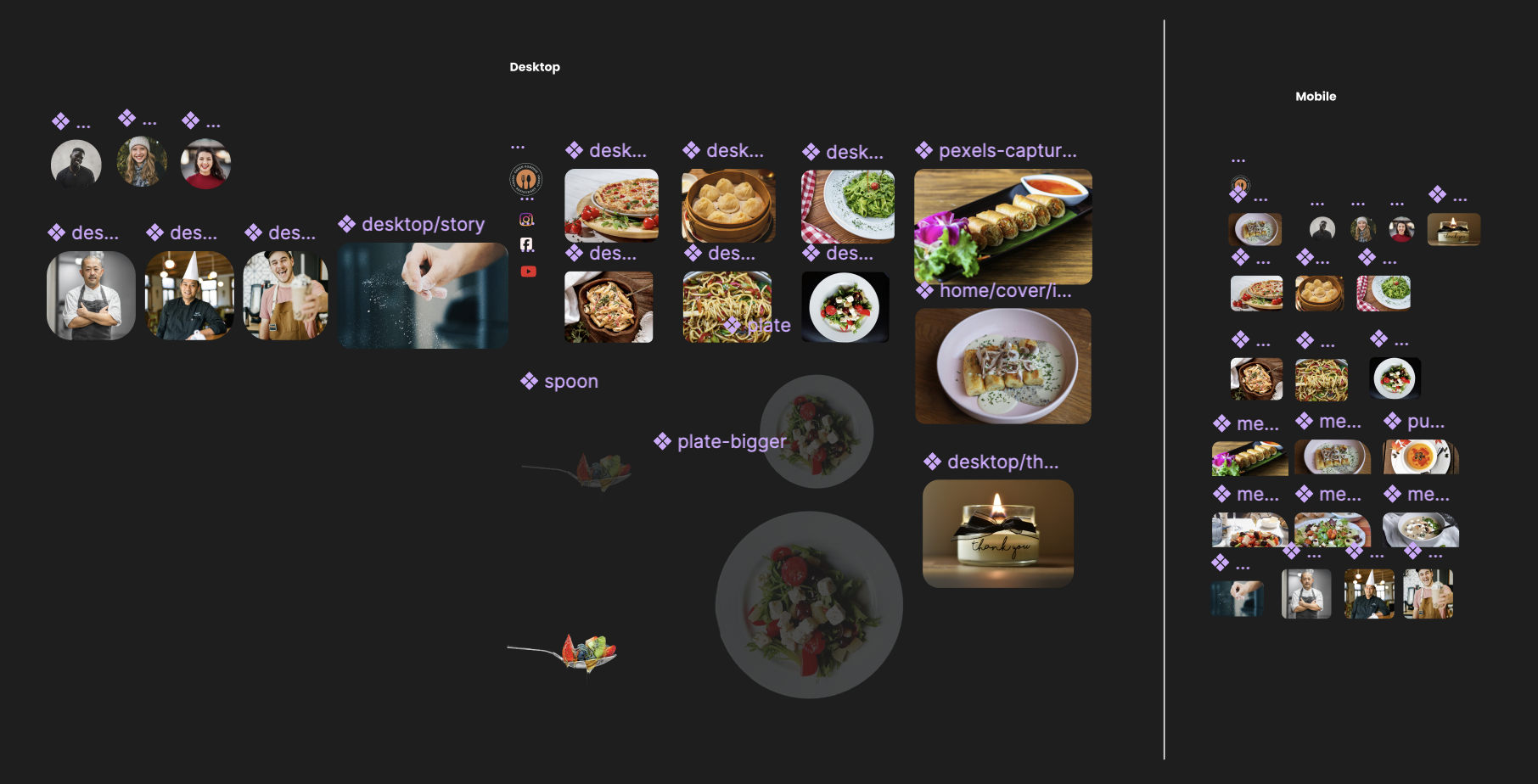
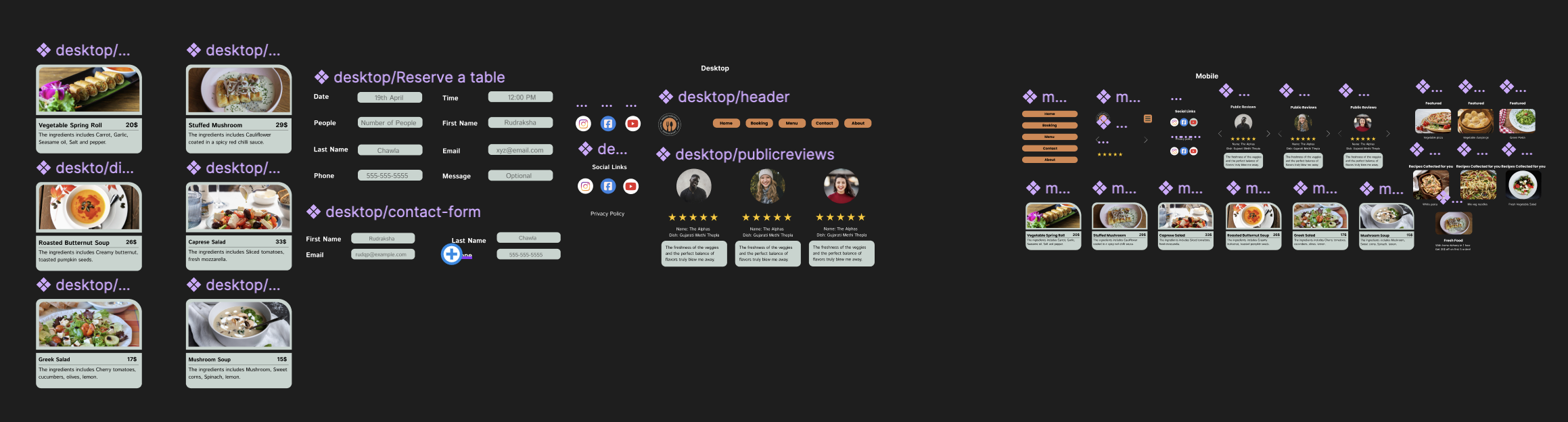
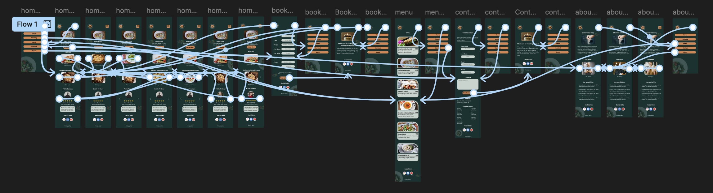
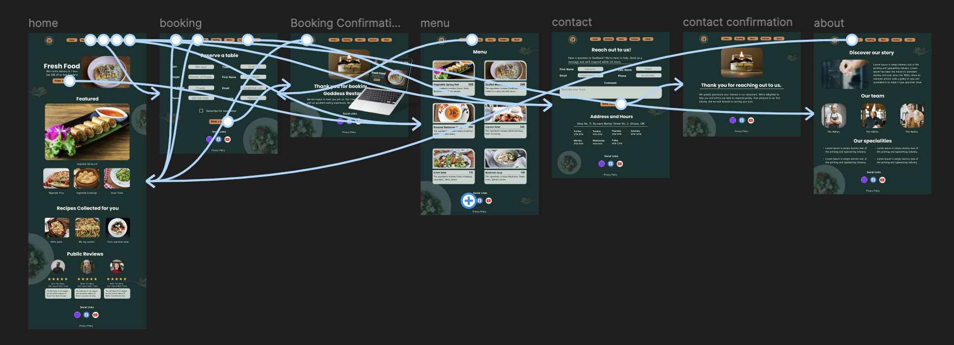
A restaurant website, designed screen by screen in Figma: the colour system, the type scale, every component, and the desktop and mobile layouts. I design in Figma and with AI, then build fast, so a brand looks the part and turns visitors into customers.
Designed by Rudraksha. Built with AI.