Home › Media › Website

Websites

Websites designed and built in Ottawa, for clients anywhere. No templates: every site is planned, designed and built around your business.

Websites · Ottawa and worldwide

How I build websites.

Six steps, the same for a one-page launch or a full online store. You always know what happens next and what it costs.

  1. 01Discovery

    A short call about your business, your customers and what the site has to do. You get a fixed quote and a timeline.

  2. 02UX and wireframes

    The sitemap and simple page layouts, so we agree on structure before anything gets pretty.

  3. 03UI design

    Colours, type and every page designed for desktop and phone. You review it and ask for changes.

  4. 04Build

    Built on whatever fits: hand-coded for speed and control, or a no-code builder you can edit yourself.

  5. 05Launch

    Domain, speed, search basics and analytics checked, then live.

  6. 0630-day care

    For 30 days after launch, fixes and small changes are on me.

What's included

  • Strategy call and sitemap
  • Custom design, no templates
  • Mobile-first, fast pages
  • Search basics: titles, descriptions, structured data
  • Contact or booking forms
  • Analytics set up
  • Launch on your domain
  • 30 days of care after launch

Can be added: Photography for your siteCopywritingOnline storeOngoing care

Websites

Quoted per project

Every site is different, so I quote after a short call. You get one fixed price and a timeline before any work starts, so there are no hourly surprises.

One photographer and designer: the person who designs your site can also shoot the photos for it.

Questions people ask

Which platform do you build on?

Whatever fits your business. Some sites are hand-coded, like rudqp.com, for speed and full control. Others are built on a no-code platform so you can change text and photos yourself. We decide together at the discovery step.

How long does a website take?

It depends on the size of the project. A landing page is quick; a larger site with a store takes longer. You get a timeline with your quote, before any work starts.

Who writes the words?

You know your business best, so you share what you have. I shape it into clear web copy, or write it from scratch if you add copywriting.

How many rounds of changes do I get?

Two rounds of changes on the design, then fine-tuning while it is being built and before launch.

Can my website take bookings and follow up for me?

Yes. Booking systems, a CRM, automatic replies and dashboards can be built into your site, quoted after a free call. See automations.

What happens after launch?

The first 30 days of care are included: fixes and small changes. After that, ongoing care is available whenever you need it.

Selected work

Two projects, each in its own case file. Open one to see it from start to end.

Start of project 01

Project 01 · Website, brand and systems

rudqp.com

A photography studio website that books clients, delivers their photos and follows up on its own. I designed every screen, directed the build with Claude, and run it on my own server. This is the project I am proudest of, and the one I know best.

Every pixel decided by me. Not a template.

  • Designed by a photographer, so the pictures always lead.
  • Booking, client login, galleries and a studio dashboard, all built for this site.
  • Light and dark mode, tuned for phone, tablet and desktop.
rudqp.com
RUDQP
No templateLight + darkCustom booking

The brand, on one board.

Before building a single page I settled the identity: what the colours are, how the type behaves and what the site is never allowed to do. Designed by me, built with Claude.

Wordmark
RUDQP

Three quiet letters, two loud ones

The gradient lives only in "QP", so the mark works at any size, on white or black.

Signature gradient
#FF7A3D#FF3D8B#9B5CFF#3D9BFF
Colour
#FFFFFF
#F5F5F7
#1D1D1F
#000000
#A1A1A6
gradient

Two neutrals do most of the work

Ink on white in light mode, near-white on true black in dark. Colour is a highlight, never a background.

Type
Aa
Inter Tight / 700 / -3%
Inter / 400 / 1.6 line
SF Pro on Apple devices

One family, no script fonts

Tight, confident headlines and calm body text. Never cursive.

Research

8 themes tested, 1 chosen

Cobalt, Forest, Noir, Marigold and more. Spectrum won.

House rules
  • Photographs always lead
  • Colour only as a highlight
  • No script fonts, ever
  • Tablet shares the desktop layout
Scale
32

pages in light and dark

All following the same board.

The small things you feel but never notice.

None of these are in a template. Each one exists because I wanted the site to feel considered from the first hover to the last click.

Menu
WeddingsPortraitsHeadshotsEvents

A menu that shows, not tells

Hover any service and a photograph slides in beside it. You choose with your eyes before you read a word.

Home hero

Eighteen photos on a wheel

The home page opens on a slowly turning ring of frameless photographs, clipped at its centre line so it reads as a horizon.

Dark mode
Most sites: white flash
This site: none

No white flash

Your theme is read before the first paint, so dark-mode visitors never get blinded on load.

Buttons

Magnetic buttons

Move your mouse near it. The button leans toward you. Only on a mouse, never on touch.

Type
Typical
jumps
This site
0 shift

Text that never jumps

Fonts are self-hosted with metric-matched fallbacks, so nothing moves when the real font arrives.

Search
⚲⌘K
Headshots · for LinkedIn and teamsWhat to wear · journalPricing · headshots

Site-wide search

Press the keys and search every page and price. The index is generated from the pages themselves.

Presence
3 people looking right now

A live, honest number

Real visitors from my own analytics, counted in the last five minutes. If nobody is here, it says nothing.

Galleries
Load more

You ask for more

Galleries show a first set, then wait. Nothing loads on its own, so the page stays fast and calm.

Motion
Motion on
Reduced motion: everything still

Motion that steps aside

Reveals, tilt and the camera cursor all switch off for visitors who ask for reduced motion, and on touch screens.

Tablet

Tablet gets the desktop

A rule I set early: tablets share the desktop layout, phones get their own. No awkward in-between design.

From "I like these" to a booked date, with no dead ends.

The whole flow lives on one page. A visitor proves their email with a six-digit code, tells me about the shoot and sees a quote. I get the request in my dashboard and accept it with one tap.

1
amina@

Start with your email

One field. Nothing else is asked until we know you are real.

2
481592✓

Enter your code

A one-time code by email. No password to invent, nothing to forget.

3

About you

Name and phone, prefilled if you already told the site earlier.

4
WeddingHeadshotsEventBrand

What are we shooting?

Pick the shoot, the date and the place. Availability is checked live.

5
✓

Your quote

A price on screen, a request in my inbox, and a confirmation in yours.

Pretty on top. Serious underneath.

What you see is the top layer. Under it sits a full booking and client system, all designed by me and built with an AI-assisted workflow using Claude.

  1. 01
    DesignLayout, type and motion, all drawn by me. The photographs lead and everything else stays quiet.
  2. 02
    Front endHand-written HTML, CSS and JavaScript. Light and dark mode. No page builder to slow it down.
  3. 03
    Booking and client portalEnquiry forms, one-time code login and private galleries for every client.
  4. 04
    CRM and automationsEvery enquiry tracked from first hello to final invoice. Confirmations and follow-ups send themselves.
  5. 05
    My own serverThe site and the galleries run on a machine I control. No platform lock-in, no monthly ransom.

One screen runs the studio.

Behind the login is a dashboard I designed for myself: bookings, a calendar, every client, enquiries, analytics, my services and prices, and the text of every page. Nothing is off the shelf.

Edit any page from the dashboardPictures that make people whisper.373 pieces of text and image are editable without touching code.

What happens when someone enquires

Enquiryfrom the site
Verifiedone-time code
Saved to CRMwith a status
Follow-up sentif no reply
Good evening, RudrakshaSample data
Enquiries
14+5
Booked
9+2
Views today
212
OverviewBookingsCalendarClientsEnquiriesAnalyticsServicesPagesMedia

End of project 01

Start of project 02

Project 02 · Concept case study

Websites, designed and built with AI.

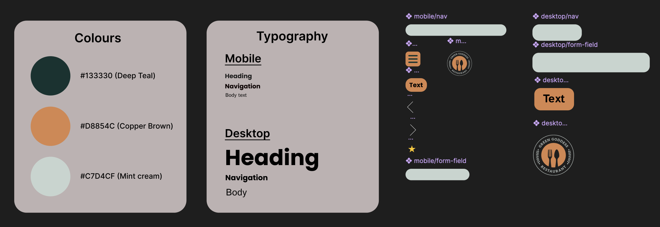
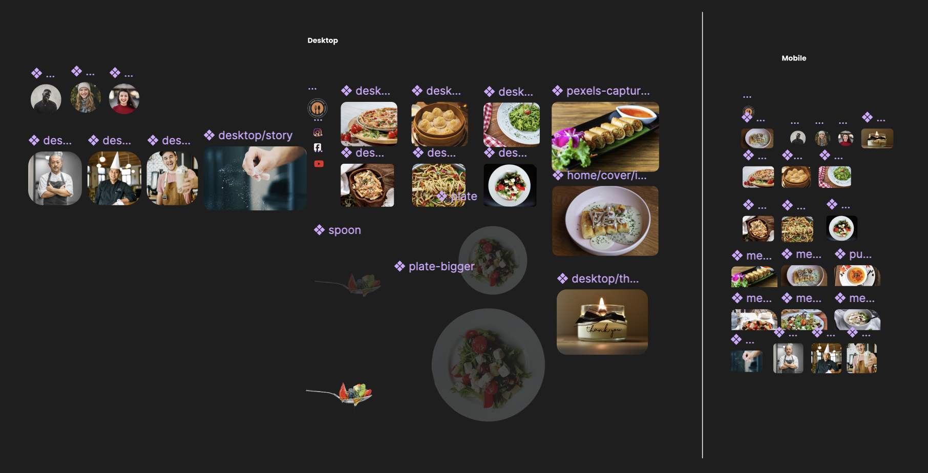
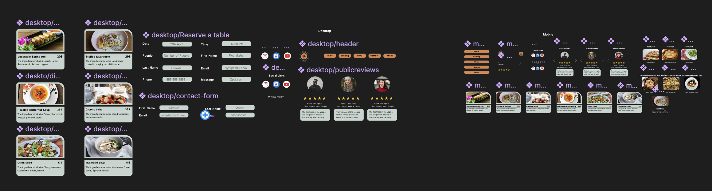
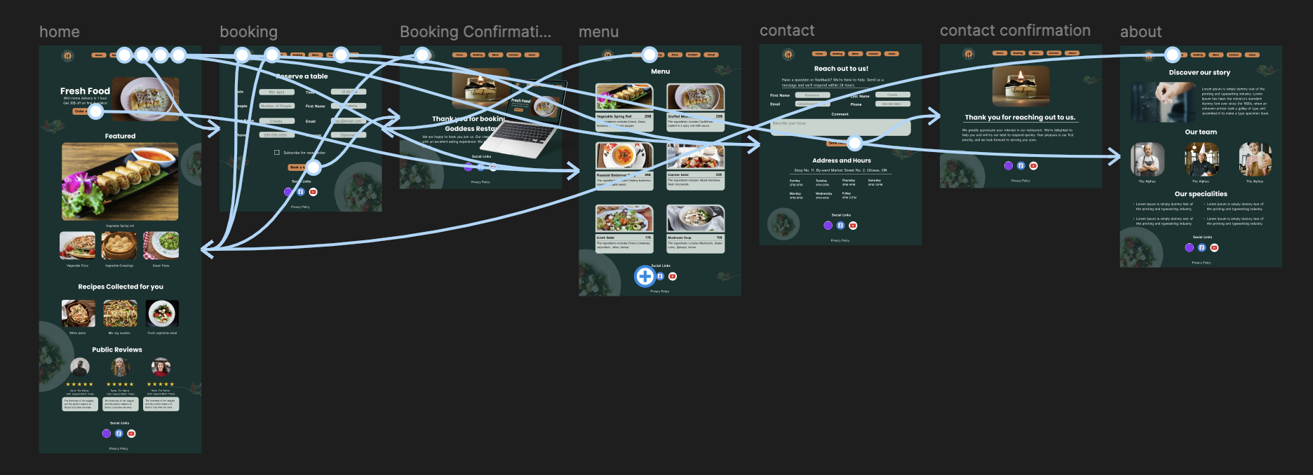
A restaurant website, designed screen by screen in Figma: the colour system, the type scale, every component, and the desktop and mobile layouts. I design in Figma and with AI, then build fast, so a brand looks the part and turns visitors into customers.

My roleUX, UI, brand system and layouts
TypeRestaurant website, desktop and mobile
Designed withFigma, with an AI-assisted workflow
DeliverablesDesign system, components, page layouts

01The problem

The two things people want from a restaurant site are often the hardest to find.

On a lot of small restaurant websites the menu is a PDF that is hard to read on a phone, and booking a table means calling. Green Goddess is a self-initiated concept: the brief I set myself was to design a restaurant site where the menu and booking are the easiest things on the page.

02The approach

  • Phone first. People look up a restaurant on their phone, often on the way. Every layout started at phone size.
  • The menu as real content, not a PDF. Readable on any screen, searchable by Google, quick to update.
  • Booking one tap away from every page.
  • A design system first. A colour system, a type scale and components built once and reused, so every page feels like the same place.

03The screens

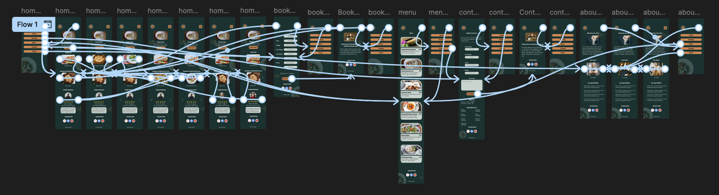
The design system, the components, and the desktop and mobile layouts, linked into a clickable prototype across home, booking, menu, contact and about.

04The result

A complete, build-ready design.

A design system, a component library, and desktop and mobile layouts for five pages, linked as a clickable prototype. It is a concept rather than a live client site, so there are no numbers to report. It shows the same process every client project follows.

On a live version, I would measureTable bookings from the siteMenu views on phonesCalls and direction taps

End of project 02